theatrical designer

From 2002 through 2010, she served as Creative Director of Design at SpotCo, a New York advertising agency that works mainly for Broadway theaters. Anderson says that in her theater posters ornamentation is peeled away little by little. “I guess there’s concern that consumers will get mesmerized or confused by the detailing and forget to buy tickets. But if we've done our job properly, the doo-dads become part of the package, and not something getting in the way that needs to be reduced or cut out.”

i was not a cool kid from the city, living in the east village like most of my young colleagues right out of school. i was a dopey kid living with her parents in the bronx. my hipness factor was extremely low. i didn’t encounter any real issues as a minority, though i was always the one people called on for ‘another’ point of view. —gail anderson about her experience studying at the school of visual arts

Image form Gail Anderson’s collection of New York city type

Image form Gail Anderson’s collection of New York city type.

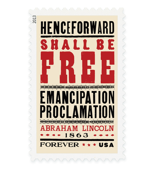
proclamation stamp

Anderson worked with art director Antonio Alcalá to produce the 2013 Emancipation Proclamation stamp—the first in a new civil rights set from the US Postal Service. To evoke the look of broadsides from the Civil War era, they employed Hatch Show Print of Nashville—one of the oldest working letterpress print shops in America. Afterwards, Anderson entered the Citizens’ Stamp Advisory Committee that evaluates and makes recommendations on potential subject matter for US stamps.

Emancipation Proclamation 150th anniversary stamp, 2013