7

Projects
with excellent typography

made with

Aug 30, 2018

VIEW PROJECT

UAnglions


1 / 7

UAnglions is a Ukrainian team of copywriters and art directors. The simplistic layout of their landing page calls for an extra boost to add excitement—and it comes with the medium Aktiv Grotesk, fully affecting over the visual hierarchy of the page.


VIEW PROJECT

Kiosk

2 / 7


“Our approach is honest, ambitious and often risky”, Skopje-based design duo Kiosk say. With Apercu grotesque sans-serif all around their website, it sounds trustworthy and looks reliable!


VIEW PROJECT

Krok


3 / 7

At first this page looks like a piece of experimental HTML art loosely based on Stanley Kubrick’s Space Odyssey, but suddenly turns out that it’s a promotion page for Krok font. Well done!


VIEW PROJECT

Mainlyphoto

4 / 7

Letters come to life in the kinetic logo of Mainlyphotography while you begin to scroll through their page. Next come beautiful photographs in full correspondence with the idea and the name of the team.


VIEW PROJECT

Time

5/ 7

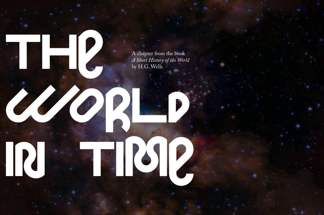
This work presents a chapter from the non-fictional historic work A Short History of the World by English novelist H.G. Wells. Whimsical and winding Deb by Erik Sachse (Napoleon Typefaces) is used for headings. “Being geometric, the typeface still tends to fall out of the system in its details. Just like the unpredictable ways of evolution”, says Pavel Kedich, the author of the project.


VIEW PROJECT

MONO

6 / 7

A small collection of records for sale, Mono grabs your attention with its flexible typographic logo, which gets squeezed while the page is being scrolled down.