PART 1

Define and conquer
Let’s start by defining readability. According to a classic paper by Edgar Dale and Jeanne Chall, readability is “…the sum total (…) of all those elements within a given piece of printed material that affect the success a group of readers have with it. The success is the extent to which they understand it, read it at an optimal speed, and find it interesting.”
In other words, readability is a metric that evaluates the ease and comfort of reading a particular text.
The question of how to create this kind of metric was asked long before the web emerged—as early as the 19th century. French psychologist Louis Émile Javal provided one of the first known studies of the matter in 1879 with his paper Essai sur la physiologie de la lecture (On the Physiology of Reading).
Javal’s key insight was that readers’ eyes don’t move steadily across the text; they actually make short, rapid movements (saccades), mixed with longer stops (fixations). Javal also noted that sometimes, while reading, the eyes unconsciously move backwards to text the reader has already seen. His idea was that the number of stops and backwards moves might help determine readability level—however, Javal lacked precise tools for the task and the idea was dropped at that time.
Two other prominent approaches came forward later, in the middle of the 20th century.
One was based on the speed of perception, while another emphasized measuring overall eye fatigue. These were pioneered by two researchers, Miles Tinker and Matthew Luckiesh—whose different approaches to measuring readability even led to a certain animosity for each other (you can learn more from a paper by William Berkson).
Top: 14/21
Bottom: 20/30
Consider the needs of your audience when selecting the type size: smaller type is harder to read for seniors, children and visually impaired people. Set in Spectral
Top: 18/18
Bottom: 18/24
Tight line spacing reduces readability, as you can clearly see in these examples. Set in Suisse Int’l
At the end of the day, Tinker’s idea of speed measurement transformed into the notion of legibility, the ease of distinguishing one letter from another as measured by perception speed. Luckiesh’s fatigue-based measurement became what is nowadays known as readability in a strict sense, the ease of reading a text as a whole—including layout, colors etc—measured using fatigue indicators like blink time.
It can also be useful to distinguish the readability of a text (as a product of writing) versus the readability of text setting. The first primarily evaluates the skill of a writer, while the second has to do with design.


Contrast
The pioneers of readability studies were obviously only dealing with printed text. However, by the end of the 1960s, computers with led screens had become relatively mainstream. Due to their inherent properties, they turned out to be more demanding on the eye.
Glowing screens make the reading experience physically different from a paper that only reflects light—the higher the brightness level, the stronger the effect. “If you set the brightness up much too high, a direct focus of light will come into your retina, causing fatigue,” explains Nick Sherman, a typographic consultant and the founder of hex projects typographic company.
High contrast between the type and the background ensure good readability
This problem can be partially tackled by selecting proper contrast color schemes, keeping brightness levels at bay. Some great tools that measure text contrast are: Webaim color contrast checker, Luminosity contrast ratio analyser, Color contrast check, and Color contrast visualiser.
Resolution
The second hindrance factor is resolution—the number of dots within a given area that can be used to convey visual information. Resolution is measured in dots per inch (dpi) or pixels per inch (ppi), with these terms used interchangeably. MacBook retina displays (praised for their high resolution) have still only exceeded 200ppi, while offset printing offers 2400dpi or even higher.
Most fonts that weren’t specially designed for computers tend to decline in readability when displayed on monitors. Historically, the two major it giants, Apple and Microsoft, have offered different solutions.
The key feature in macos font rendering was so-called anti-aliasing—a technique used to add pixels of different color to letter fringes, making them look more smooth.
Alias. Click to zoom in
Anti-aliased
In contrast, Windows tried to maximize legibility. They adapted the distribution of pixels within letters and words to make pixel density and letter shape optimal for reading. Microsoft used what’s now called font hinting, a set of instructions describing when to add additional pixels to each letter. This allows for improved legibility, but alters and even distorts original letterforms.
Unhinted character
Hinted character
However, changes to how fonts are rendered have reduced the differences between these approaches.


Part 3
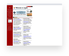
The first website was published in 1990 by computer scientist Tim Berners-Lee and now it seems like an eyesore. Early web sites were basic, using vertically structured, text-heavy pages with few graphics. Before the introduction of tables as a web page structure, there were few design components and no way to emulate the layouts of conventional printed texts.
In the early web there were no people well-versed in typesetting. Website layouts were fluid (did not have fixed width), so text lines came in any possible width. That was not so great: all sorts of typographic rules aimed at text legibility were smudged,” says Readymag product designer Stas Aki. The situation demanded new approaches to the creation of web layouts.
The variety of screen sizes also strongly impacted web layouts and quality of typesetting. While print designers knew beforehand the paper format that will house their work, web designers worked in a situation of uncertainty, knowing that their designs would appear in multiple ways on multiple screens.
This problem was mostly tackled with the mass introduction of responsive design around 2007, along with the launch of the first iPhone.

1st generattion iPhone
iPhone 11
I think it pushed the idea of responsive web design to the forefront. Mobile sites were often made separately from the desktop version, and that was happening before iPhones existed. I think the first iPhone is a symbol of when mobile web browsing became a mainstream thing. As far as readability in particular, the iPhone definitely set a lot of standards for resolution; like the idea of having a retina display with an extremely high resolution,” Nick Sherman recalls.
New generation mobile devices allow a resolution up to 1000dpi. With the continuing increase in screen resolution for desktop computers and portable devices, readability should improve as well.


115
150
Fonts that address special
issues
Part 4
Another important development was the proliferation of new fonts. Over the past several decades, Microsoft and Apple have approached the issue of web legibility repeatedly, producing more and more fonts targeted to the peculiarities of digital displays and the web.
In the early 90s, British type designer Matthew Carter created the early web 1.0 fonts Georgia (1993) and Verdana (1996). Commissioned by Microsoft specifically for text on webpages, both fonts were designed in bitmaps to match the pixels of the standard screen resolution at the time and then translated into outline fonts. For legibility and readability on screens, Carter designed these fonts with large x-height, open aperture, and generous space.
Matthew Carter, July 16 2014. Photo: Christopher Lewis. CC by 4.0
Georgia, 1993
Both designed by Matthew Carter, hinted by Tom Rickner
Verdana, 1996
A decade later, sub-pixel rendering appeared—also known as font smoothing, it adds red, green or blue pixels to letter fringes for clearer reading even on low-res screens. The origin of subpixel rendering remains controversial: Apple, then IBM and Microsoft, patented various implementations with their own technical differences, but Microsoft was the first to implement the technology in their products. Soon after, Microsoft also released the Clear Type font collection, a suite of fonts designed to demonstrate the advantages of sub-pixel rendering. The collection included Calibri, Corbel, Cambria, Candara, Consolas, and Constantia.
Another major development came in 2009. Small Batch., Inc released Typekit—a collection of web fonts from different foundries, making use of the @font-face feature of CSS while protecting them from infringement at the same time. @font-face was available from 1998, but Typekit was the first collection to solve the problem of font copyrighting, allowing a new market for custom web fonts to bloom. It’s difficult to imagine now, but before Typekit all web typography was either done with one of the dozen or so ‘web safe’ fonts or rendered in graphics.
In 2014, Apple released its San Francisco font family, inspired by iconic modernist type Helvetica. San Francisco includes several fonts, each aimed for a different environment: SF is meant for macOS, iOS and tvOS, while SF Сompact was designed for Apple Watch. The main difference between them is that letters with round shapes, such as “o”, “e”, and “s”, have rounded sides in San Francisco, whereas in SF Compact they are flat. These flat sides allow the letters to be laid out with more space in between each character, making the text more legible at small sizes (which is particularly important for the watch).
Neue
Alt
Neue
This paragraph is set in Pragmatica (Paratype). The typeface was obtained via Typekit (now Adobe Fonts)