a
a
a
a
*
3.
Fun, backed up with structures:
Qian Sun reflects on Paul Rand’s legacy
One of the world’s most renowned graphic designers and the TDC medalist of 1984, Paul Rand believed that everything is design, and that design in turn serves as a timeless universal language through its simplicity and geometrical nature.
Armed with these ideas, he reached out to the next generation of designers, showing them the importance of natural simplicity, the advantages of a good giggle, and the power of competent presentation.
China-born and New York-based graphic designer Qian Sun celebrates Paul Rand’s impact and practices his ideas while working on branding, environmental design and illustration. In 2017 the Type Directors Club awarded her a Certificate of Typographic Excellence for her personal exhibition ‘Architype’, which reveals the stories behind iconic New York buildings through typography.
Qian is an active member of TDC and a vital part of the evolving local design community. In this piece, Qian reveals how Paul Rand influenced her vision, style and approach to work.
(1914–1996)
a 20th-century American graphic designer and art director especially famous for his corporate visual identities for IBM, ABC and UPS.
Rand started his career with editorial designs, magazine covers and advertising, highly influenced by the German Bauhaus, De Stijl and Constructivism movements. As his style evolved and his recognition grew, the master turned to corporate brandings, lecturing and writing.
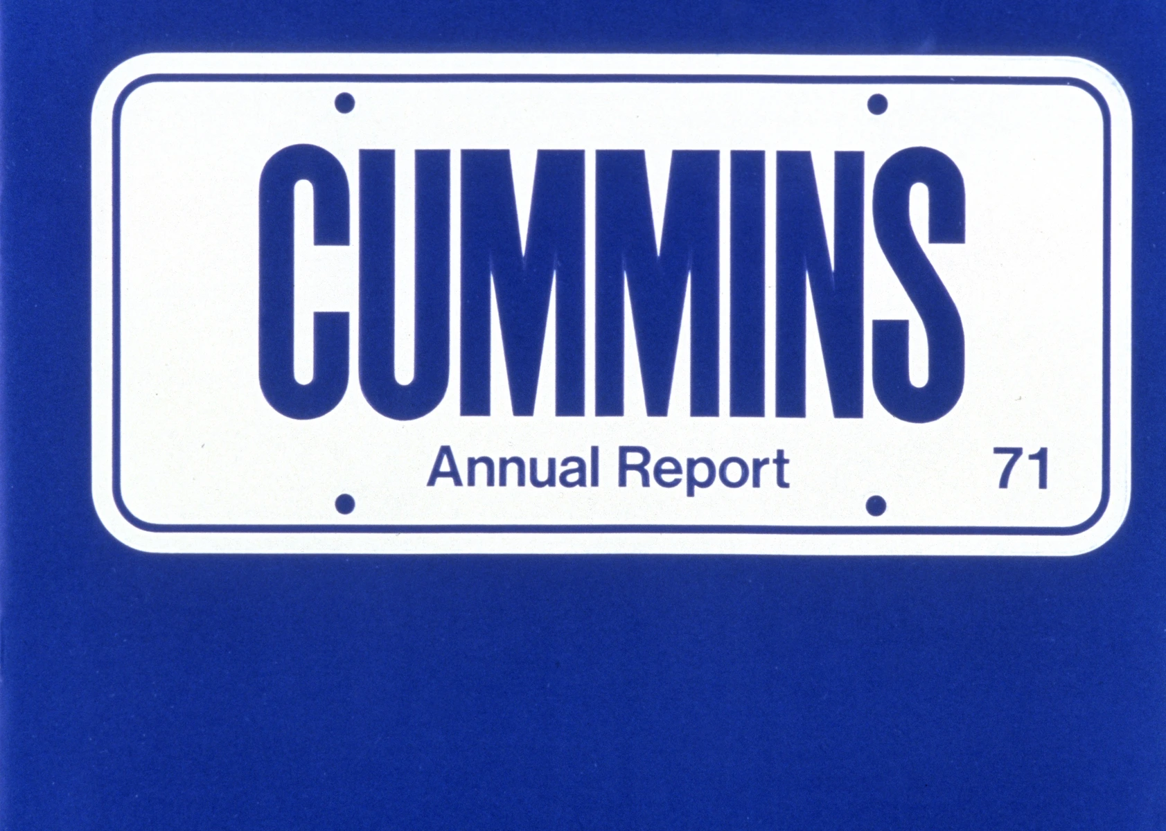
Paul Rand’s annual report for Cummins, 1971. © Type Directors Club.
Deliberate fun
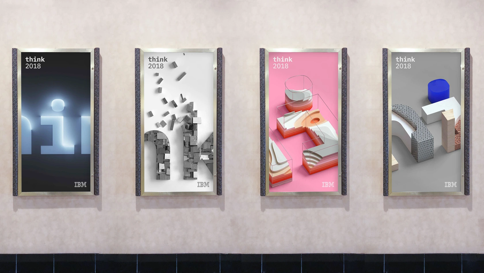
Paul Rand was great at squeezing playfulness into more serious things. His works are very practical and business-oriented, but at the same time are playful and full of surprising elements. Why can’t we have a little bit of fun in design, if it’s backed up with structures and systems? While working with IBM on the environmental graphics for the ‘Think’ conferences in 2018 and 2021, I caught myself admiring how great the IBM logo is and how perfectly it still works. It’s simple, bold and fun—something you don't see a lot in the corporate world. The variation with the eye, bee and ‘M’ is my absolute favorite and it’s on the only logo t-shirt I wear.
Printing production for IBM. © Type Directors Club.