P
i
P
i
P
i
P
i
m
m
ssssss
ssssss
ssssss
*
Y
a.
c.
m
4.
Illustrating with type:
Sven Lindhorst-Emme on Paula Scher’s role in type design
A good design has more than meets the eye—it’s a combination of colors, materials, formats, imagery, shapes, patterns, and even writing.
This last one is what fascinates Sven Lindhorst-Emme most of all. Having worked as a lithographer for 10 years, at the age of 30 he quit his job to study graphic design in university, which, Sven recalls, was one of his best decisions.
Now in partnership with Lea Hinrichs, Sven runs a Berlin design studio specializing in graphic design and typography. In 2014 he became a member of the TDC. In this piece, Sven celebrates the formidable impact of Paula Scher, the 2006 TDC medalist and an important figure for all up-and-coming designers, and dwells on the TDC’s influence on his own path.
(born 1948)
an American designer, painter and educator, has served as the first female principal of the international design consultancy Pentagram since 1991. Scher created an iconic landmark identity for The Public Theater, and her identities for Citibank and Tiffany & Co. have become case studies for American brands.
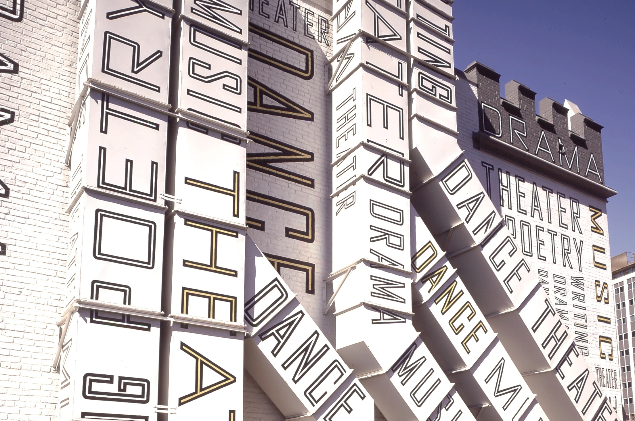
Words and vast letters running along the walls–an interior and exterior design of the New Jersey Performing Arts Center created by Paula Scher.
Expressivity as of paramount value
My work is heavily influenced by typography. I like to experiment with fonts and individual letters, pull them in length or width, and find or craft new shapes. In my opinion, if done properly, this is what creates completely new typefaces and turns heads through tension and curiosity. I think that partially distinguishes Scher’s approach. For her, expressivity is of paramount value.
One of the works that best represents me as an artist as well as my approach is the trio poster ‘The capital is gone—we are the capital!’ It comprises handwriting mixed with illustrations. I had the urge to craft something entirely new and expressive with more than just typefaces. Another challenge was to build objects that looked almost realistic but kept their illustration character.
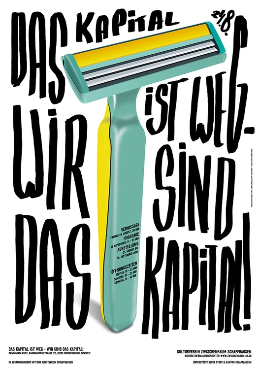
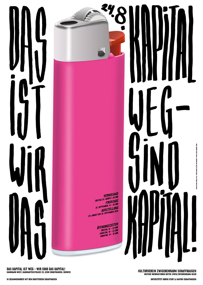
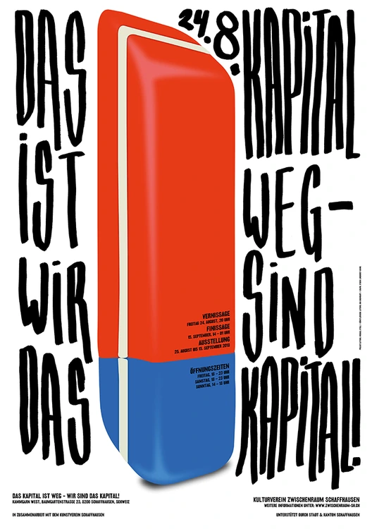
Das Kapital ist weg—Wir sind das Kapital (The capital is gone—we are the capital!), by Sven Lindhorst-Emme, 2019.