PART 1

Define and conquer
Let’s start by defining readability. According to a classic paper by Edgar Dale and Jeanne Chall, readability is “…the sum total (…) of all those elements within a given piece of printed material that affect the success a group of readers have with it. The success is the extent to which they understand it, read it at an optimal speed, and find it interesting.”
In other words, readability is a metric that evaluates the ease and comfort of reading a particular text.


Contrast
The pioneers of readability studies were obviously only dealing with printed text. However, by the end of the 1960s, computers with led screens had become relatively mainstream. Due to their inherent properties, they turned out to be more demanding on the eye.
Glowing screens make the reading experience physically different from a paper that only reflects light—the higher the brightness level, the stronger the effect. “If you set the brightness up much too high, a direct focus of light will come into your retina, causing fatigue,” explains Nick Sherman, a typographic consultant and the founder of hex projects typographic company.
High contrast between the type and the background ensure good readability
This problem can be partially tackled by selecting proper contrast color schemes, keeping brightness levels at bay. Some great tools that measure text contrast are: Webaim color contrast checker, Luminosity contrast ratio analyser, Color contrast check, and Color contrast visualiser.
Resolution
The second hindrance factor is resolution—the number of dots within a given area that can be used to convey visual information. Resolution is measured in dots per inch (dpi) or pixels per inch (ppi), with these terms used interchangeably. MacBook retina displays (praised for their high resolution) have still only exceeded 200ppi, while offset printing offers 2400dpi or even higher.
Most fonts that weren’t specially designed for computers tend to decline in readability when displayed on monitors. Historically, the two major it giants, Apple and Microsoft, have offered different solutions.
The key feature in macos font rendering was so-called anti-aliasing—a technique used to add pixels of different color to letter fringes, making them look more smooth.
Alias. Click to zoom in
Anti-aliased
In contrast, Windows tried to maximize legibility. They adapted the distribution of pixels within letters and words to make pixel density and letter shape optimal for reading. Microsoft used what’s now called font hinting, a set of instructions describing when to add additional pixels to each letter. This allows for improved legibility, but alters and even distorts original letterforms.
Unhinted character
Hinted character
However, changes to how fonts are rendered have reduced the differences between these approaches.

Evolution of layouts and typesetting on the web
Part 3
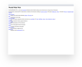
The first website was published in 1990 by computer scientist Tim Berners-Lee and now it seems like an eyesore. Early web sites were basic, using vertically structured, text-heavy pages with few graphics. Before the introduction of tables as a web page structure, there were few design components and no way to emulate the layouts of conventional printed texts.
115
150