
Proxima Nova + Chaparral


Font Pairing
proxima nova
+chaparral
Sauber Script + Aktiv Grotesk
Font Pairing
sauber script
+aktiv grotesk
in action
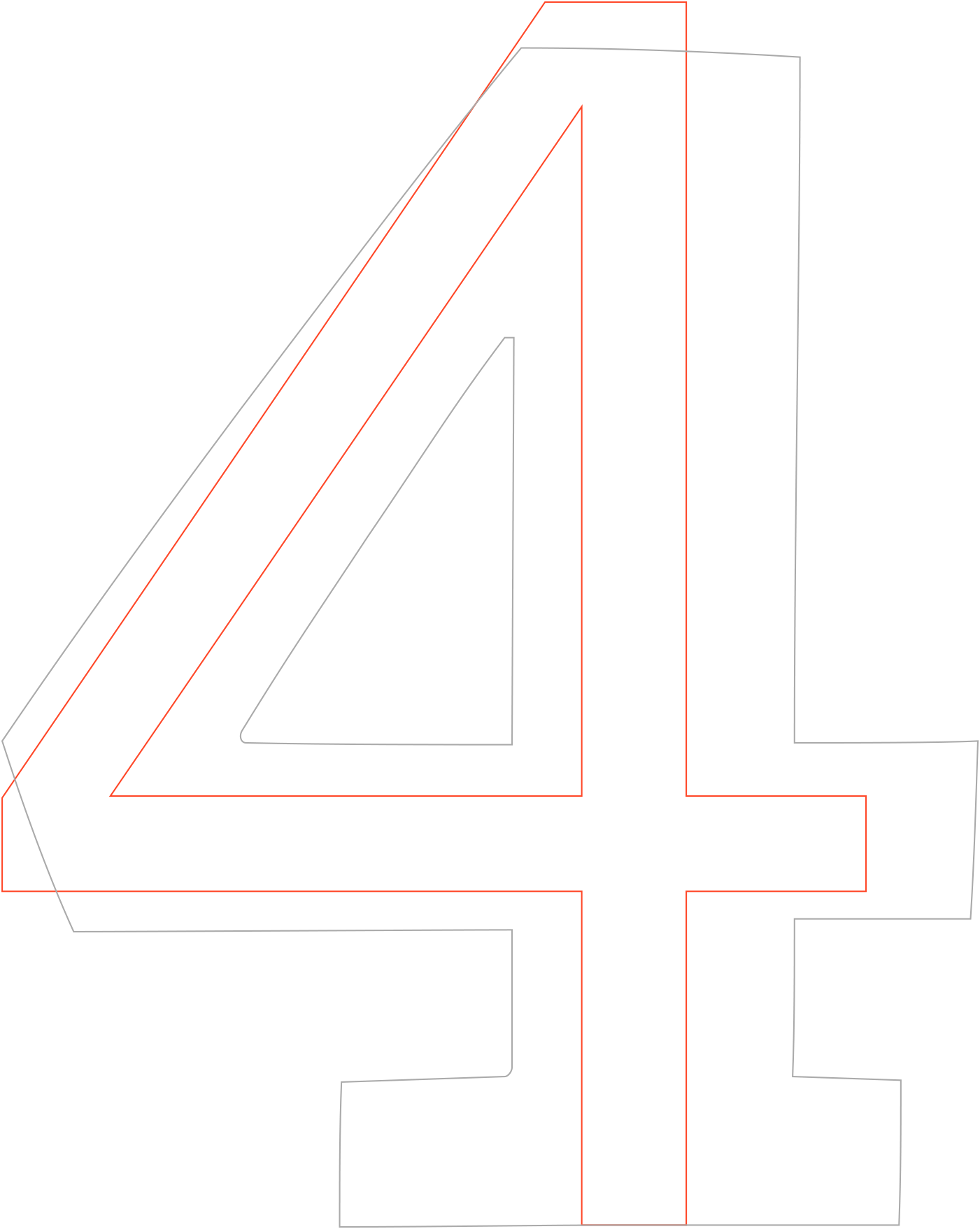
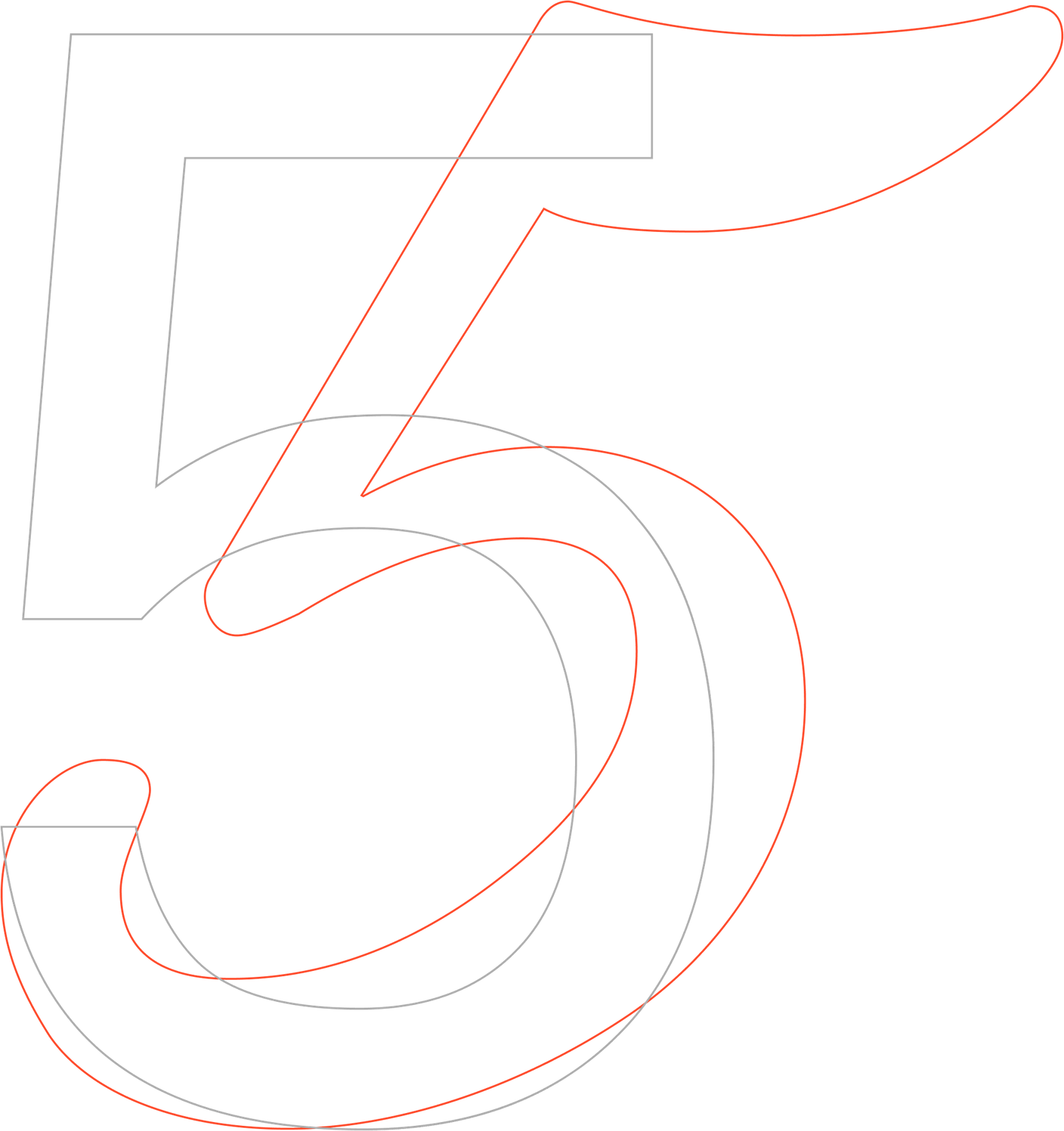
Sauber Script 140 / 115 px + Aktiv Grotesk 18 / 20 px
New
Staples
12th of August Ahlvar had a release party at our PR agency's showroom Pretto PR in Stockholm to celebrate the first collection had been sent to the stores.
SHOP
why do they
match?
The pairing of Sauber Script and Aktiv Grotesk stands on the principle of contrast: the fonts are entirely distinct from each other. Aktiv Grotesk is sleek and versatile, modern and utilitarian, it takes an authoritative but neutral position, lending your message just the right impact. Sauber Script is the complete opposite: a sweet ice-cream font, active and friendly. That being said, they both have very clean silhouettes. Together, Sauber and Aktiv Grotesk reinforce and emphasize each other's features.
a b c d e f g h i k l m n o p q r s t u v w x y z
Sauber Script Uppercase
a b c d e f g h i k l m n o p q r s t u v w x y z
Lowercase
1234567890
/„“§( )[ ]%!-;:,.«»
<>?
Numbers & Symbols
a b c d e f g h i k l m n o p q r s t u v w x y z
Aktiv Grotesk Lowercase
a b c d e f g h i k l m n o p q r s t u v w x y z
Uppercase
1234567890
/„“§( )[ ]%!-;:,.« »< >?
Numbers & Symbols
1. Proportions
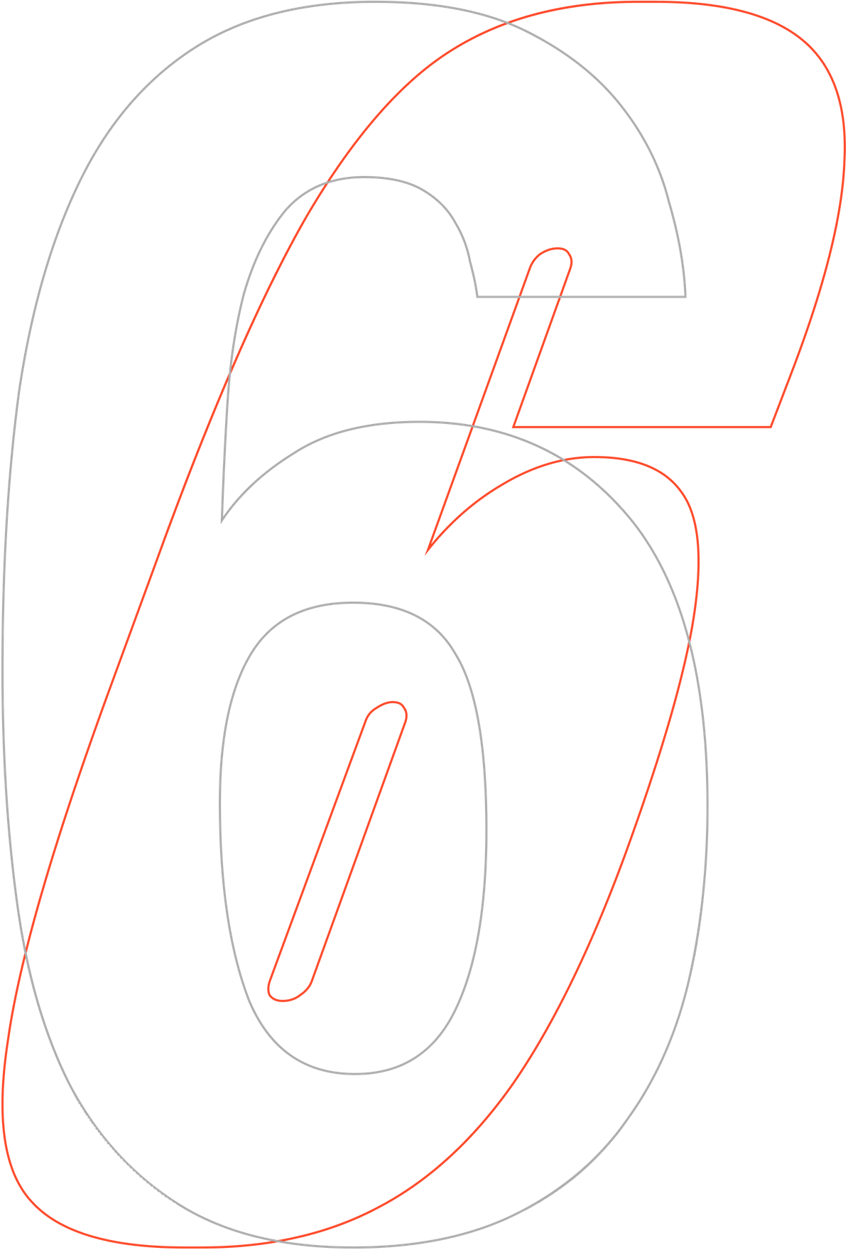
Sauber (German for ‘clean’) is designed to be used at large sizes and in headlines, where details are clearly visible. It has very compact proportions, with no outrageous ascenders and descenders that might clash otherwise. This also allows the font to be used effectively inside of boxes and buttons.
Aktiv Grotesk was designed for modern communication channels, from billboards to mobile devices. Eleni Beveratou, the Creative Director of Dalton Maag studio (where the font was designed) explains: “We paid particular attention to how Latin proportions fit well with other writing systems that we have developed, for example, in Arabic and Hebrew, making sure that they work in harmony when used together. This is especially true for writing systems that don't have uppercase and lowercase letters.”
“The pair will live in harmony when Sauber Script is used as the display font and Aktiv Grotesk for body copy. When paired up in the same size, they will also weave together successfully: the geometry of Aktiv Grotesk acting as a frame, a lattice around which Sauber can curl. In this case, it will play the role of icing or whipped cream—the substance that turns an ordinary crust into a cake, ” Readymag designer Tanya Egoshina summarizes.
2. Details
Sauber is a brush script; clear and bold, but also soft and calm. “Like any script, this font is about humanity and craftsmanship—and about order at the same time. Sauber contrasts with other scripts thanks to its flexibility, abundance of uses, wide language support and even built-in underscores. It has a lot of glyphs (including some that you wouldn’t expect to see in a script), many ligatures and even swashes (look for them in the Glyphs panel). In a nutshell, it has everything to help you make your text indistinguishable from a real inscription. Sauber is a friendly script, and this genre is timeless. Human, but neat; contemporary, but a little bit retro. This style will remain in demand for a long time,” explains Ilya Ruderman, the creator of the font’s Cyrillic version.
Aktiv Grotesk lies at the intersection of many classic grotesque designs, combining qualities into a unified and coherent expression, and functionality. “This typeface is truly modernist — it was conceptualized with expansion into a myriad styles and languages in mind, to help you build a true type system. It has clear lines and no frills, but subtle design features lend it a personality outside the known genres,” explains Bruno Maag, the Chairman of Dalton Maag studio.
about
Sauber Script
Aktiv Grotesk
Michael Hochleitner
2014
Ilya Ruderman
2020
Typejockeys / CSTM Fonts
Dalton Maag studio
2010
Aktiv Grotesk is a flexible and diverse font family, available in 24 weights with matching italics that range from Hairline to Black. A variable font option allows you to take full advantage of Aktiv Grotesk's range, exploring every weight and width, plus every style in between. “With Aktiv Grotesk we knew that we had the opportunity to design a truly classic modernist typeface. The design orients itself on the usual suspects from 60 years ago, but has cleaner lines than its counterparts and more consistent weights and widths. It was important, however, to ensure that it had a personality attached to it and avoided blandness. We accomplished that with an ever so slight shearing at some terminals,” recalls Bruno Maag.
“I think Aktiv Grotesk is that friend who you can take to any occasion and they blend in as if they always belonged there. Depending on how it’s used, its tone of voice can speak to many perspectives. We see examples where Aktiv Grotesk is used in a purely informative way, and others where it really creates a unique tone of voice. Like how the brand, Sonos, has used it,” Eleni Beveratou observes. “In particular, I would recommend using Aktiv Grotesk in situations where more than one writing system is required, but, due to its versatile design, it is also a good choice when one needs a typeface for a multitude of environments and usages.”
Austrian typographer Michael Hochleitner created Sauber Script as a custom project for the logo of a client. Realizing the potential of his work, he later developed Sauber into a full typeface. Sauber Script is heavily influenced by the aesthetics of 1950s signage. “Less a handwritten font, it’s something you might want to use in bigger sizes to achieve a clean and smooth look; without being boring,” Hochleitner says.
In 2020, Sauber Script was expanded: the co-founder of Russian studio CSTM Fonts and type.today store Ilya Ruderman designed a Cyrillic alphabet for the typeface. That means it supports even more languages and is a great fit for international advertising. “Designing the Cyrillic alphabet for Sauber Script consisted entirely of challenges and peculiarities. Michael had to revise the Latin alphabet, changing some design solutions that are not typical for Cyrillic scripts. The peculiarity of Cyrillic handwriting, particularly lies in the connections of letters. In the Latin alphabet, all letters can be connected through the top. In the Cyrillic alphabet, there are some letters that are connected through the bottom, using a break somewhere in the lower half of the sign. The Cyrillic alphabet turned out to have a completely different rhythm. To harmonize everything, we had to come up with some new solutions and expand the logic of letter connections in the Latin alphabet,” Ilya Rudeman says.
Spektra + Acumin Pro C.
Font Pairing
spektra
+acumin pro c.
in action
Spektra 140 / 115 px + Acumin Pro C. 18 / 20 px
New
Staples
12th of August Ahlvar had a release party at our PR agency's showroom Pretto PR in Stockholm to celebrate the first collection had been sent to the stores.
SHOP
why do they
match?
Spektra and Acumin belong to the neo-grotesque font family—this kinship is most pronounced in their elongated vertical proportions. Despite that, the nature of these ‘relatives’ is fundamentally different. Spektra is a reasonable, but ironic display typeface with a harsh temper; it can also get a radical slant. Its vigor is balanced and toned down by the narrow Acumin Pro C.—neutral as water and always discreet. When paired up, Spektra will convey the emotions and topicality of the message, allowing Acumin to complete the story in a calmer tone.
a b c d e f g h i k l m n o p q r s t u v w x y z
Spektra Uppercase
a b c d e f g h i k l m n o p q r s t u v w x y z
Lowercase
1234567890
/„“§( )[ ]%!-;:,.«»<>?
Numbers & Symbols
a b c d e f g h i k l m n o p q r s t u v w x y z
Acumin Pro C. Lowercase
a b c d e f g h i k l m n o p q r s t u v w x y z
Uppercase
1234567890
/„“§( )[ ]%!-;:,.« »< >?
Numbers & Symbols
7 of 9