futura
garamond


Futura + Garamond


Font Pairing
Benton Sans + Farnham

Font Pairing
Benton Sans + Farnham
Font Pairing

in action
Farnham 150 / 140 pt + Benton 24 / 28 pt
why do they
match?

Farnham and Benton Sans are quite similar in the energy and dynamics of their letterforms, proving that faces of various epochs and styles can work well together despite the absence of specific shared elements. Farnham, a contemporary version of a transitional serif, teams up well with the early-20th-century American sans serif through a likeness of temperament and proportions.
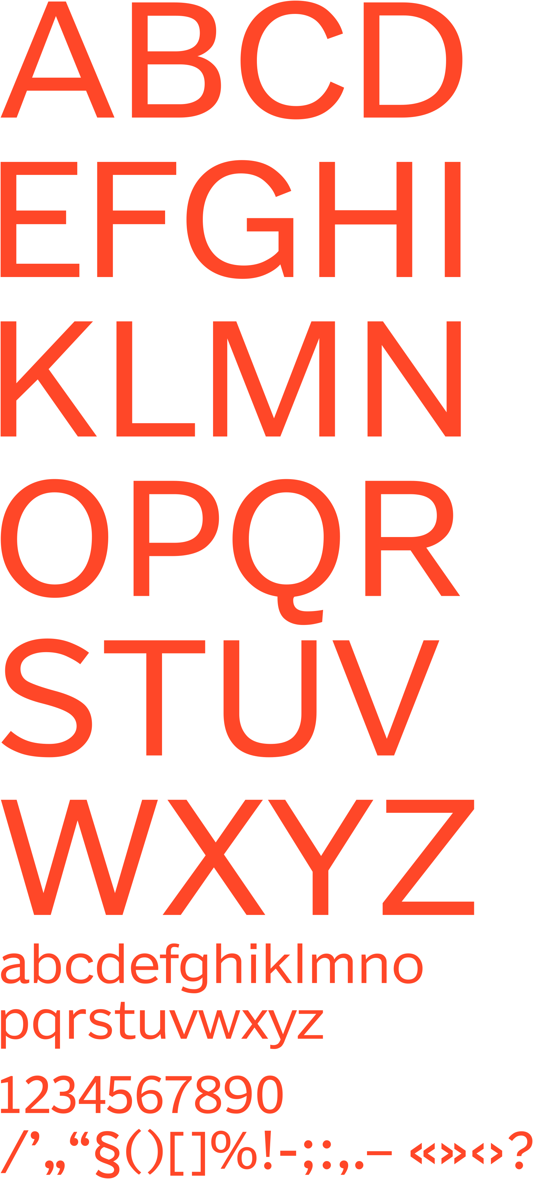
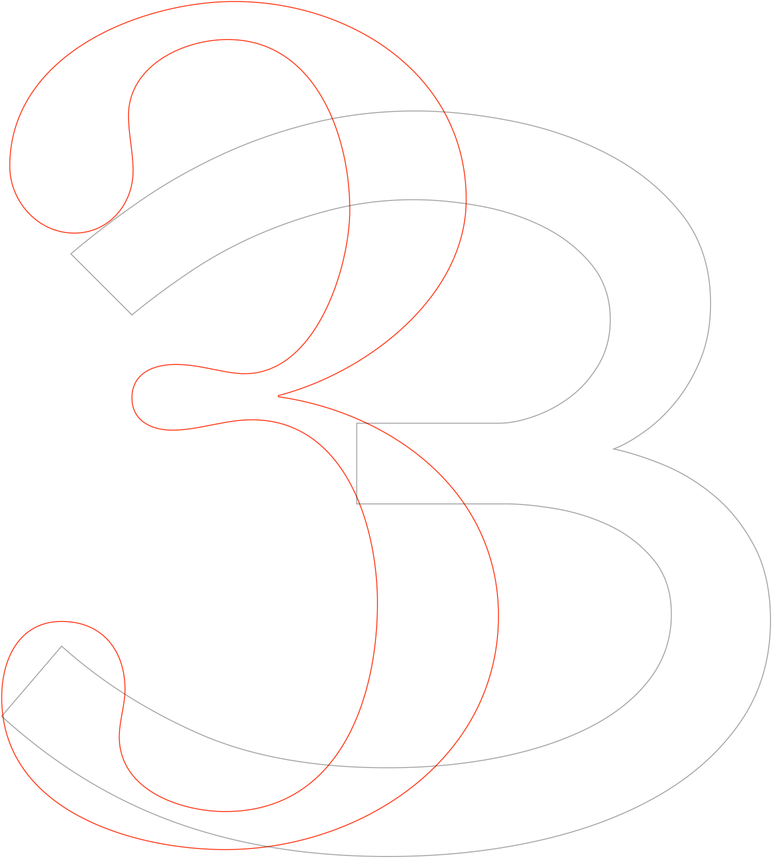
Benton Uppercase
Lowercase
Numbers & Symbols
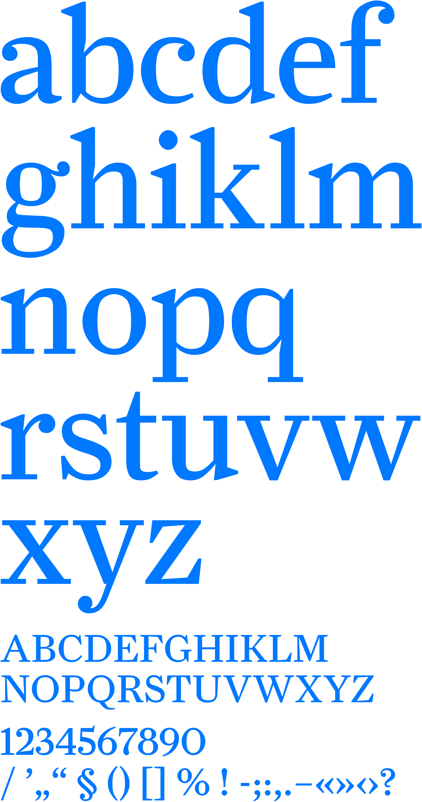
Farnham Lowercase
Uppercase
Numbers & Symbols
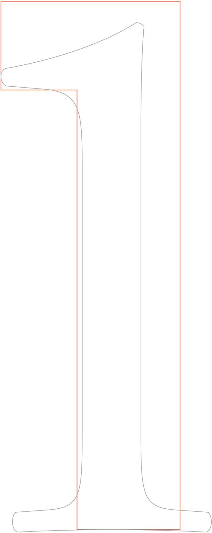
1. Proportions
Notwithstanding the obvious difference in physical dimensions (the blockiness of the Benton is part of its adaptation for use as a text face for screens), the faces are alike in the squatness of their lowercase letters, which have distinctly short ascenders and descenders. Benton Sans has a bit larger x-height than its partner.
Farnham and Benton Sans are regularly proportioned typefaces. Notable in their capitals is the suggestion of rectangles and ovals rather than squares and circles.
The lowercase letters of both are wide. Given that “a well-ventilated” line is easiest to read, openness of letterforms is important when it comes to choosing a text face. In Benton Sans, note the undisturbed simplicity of the apertures with outward-pointing terminals. In Farnham, whose letters tend to be compact, openness is cleverly achieved by the squareness in the counterparts, letting the lowercase letters gently open up.
The very close similarity in proportions — the large x-height and short ascenders and descenders — optimize the readability of both faces for small text blocks and create a more regular and fairly tight (perhaps calmer) leading.
2. Details
Farnham is clever and resourceful in many ways, but its baroque details and vibrancy are always at the service of essentially pragmatic tasks. On closer examination, the businesslike, deliberately plain forms of Benton Sans have almost the same degree of dynamics as Farnham, the serif partner.
about
Farnham
Benton Sans RE *
Morris Fuller Benton, David Berlow,
Cyrus Highsmith, Tobias Frere-Jones
Font Bureau, 2010
Specimen 383 Kb
In his 40 years with ATF (American Type Founders), the outstanding American type designer Morris Fuller Benton created more than 200 typefaces, many of which are still used.
His first sans serif, Franklin Gothic (1903), was based on American faces of the late 19th century but with more balanced and open forms. At first, Franklin existed only in boldface and was only used for display. Within several years, however, it had become the basis for a more compact and lighter body face — News Gothic (1908) — which was hailed in a 1912 study as one of the most readable typefaces.
Both of these Benton sans serifs, best-sellers in their time, proved highly adaptable to the rapidly changing technologies of the 20th century — from letterpress and machine composition through photo- and digital typesetting.
Benton Sans RE* is a version of Benton Sans, which was created by a group of designers at Font Bureau (Tobias Frere-Jones, Cyrus Highsmith and David Berlow) on the basis of the original Morris Fuller Benton drawings for his New Gothic face.
The typeface is available to Readymag users in four styles: Regular, Italic, Bold and Bold Italic.
The asterisk (*) indicates that the face belongs to a series of screen fonts specially designed for use as body faces.
flickr.com/photos/eyemagazine
Typefaces created by the ingenious 18th-century punch-cutter Johann Michael Fleischmann were given new life at the end of the last century with the almost simultaneous creation of faces that, in various ways, drew on them for inspiration. These range from the outstanding revivals done by Erhard Kaiser for the Dutch Type Library (DTL Fleischmann, 1997) to Mathew Carter's Fenway (1998), created for Sports Illustrated magazine, which captures not just the look of a Fleischman face but, even more, its spirit.
The rebirth of interest in the old master in the 1990s, when a fondness for expressive typography swept over almost the entire world, were hardly unrelated events. There are probably no more vivid and fanciful typefaces in the history of the creation of faces than his, none more contradictory in structure, yet so well adapted for reading.
Christian Schwartz's Farnham is a modern version of the “sparkling” forms of the great German. Schwartz's typeface, which its creator has divested of what he saw as unnecessary historical detail, has the characteristic energy of the baroque, fed by inner dynamics and the intensity of conflicting forces.
The typeface is available to users of Readymag in six styles: Display Light, Light Italic, Text Regular, Italic, Bold, Bold Italic.
Century + Sweet Sans
Font Pairing