It is crucial for every feature to provide a recognizable function. An interface designer should always wonder how a user will know an action is possible.
Preferably, the user interface should be self-explanatory (i.e., easy to understand without any tutorials or support services).
All features should also be discoverable in the interface, without external help.
An interface should keep users informed about their actions and any changes.
2.1
2.2
2.3
2.4
When the interface is self-explanatory, it becomes easy to learn and use.
The interfaces should be easy to understand, learn, and efficient over time.
The ideal humane interface reduces the interface component of a user's work to pure habituation.
A well-designed human interface should not be split into beginner and expert modes. Instead, think of the interface as a beginner-to-expert journey.
The learning phase of working with any professional interface requires conscious attention. Simplicity, clarity of function, and the visibility of a user interface helps beginners learn.
The expert phase is characterized by fast unconscious use.
3.1
3.2
3.3
3.31
3.32
3.33
3.34
3.35
According to Jef Raskin, qualities like suitedness to the task and modelessness lead the way for UI to be habitual.
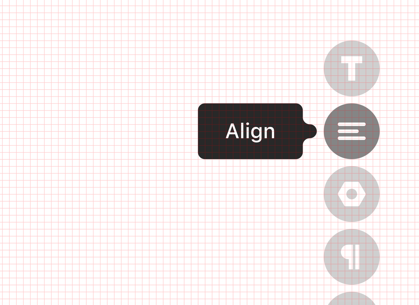
Users shouldn’t have to get lost among multiple elements. There should be only one way to perform a task. Jef Raskin wrote, the more ‘monotonous’ an interface, the more quickly it becomes habitual.
Avoid alternate modes that can shift the user's attention. And if you have them, make sure they are distinctly marked.
Let’s look at the round buttons at the bottom of the screen. When the Pages Menu is open, tapping the button switches on the Settings Menu. When the Settings Menu is open, tapping the same button will open the Pages Menu again. Users didn’t notice the buttons’ switch, and weren't sure how to open the Settings panel. We made a mistake trying to save space on the page.
Non-split interfaces are more consistent for users, and easier to maintain for designers and developers.
3.36
Reliability is often thought of as purely technical. But a fairly reliable interface can still be designed on top of a system that isn’t 100% reliable.
The system should never lose any work a user has done or any information they have entered.
All actions must be auto-saved.
It should be possible to restore large chunks of content, like pages or projects.
4.1
4.2
4.3
4.4
Design has always been about invention. On the way to something new, designers are constantly experimenting. Even a simple design task requires figuring out how to build a coherent message out of raw content.
Design software should provide an enjoyable environment for creative work.
5.1
5.2